Monday, April 25, 2011

J04

I love this one. It was found in the home of the girl I babysit.

Who knew a stool could be smiling?

I found a couple on my oven.


This guy looks a bit melancholy.

Sunday, April 24, 2011

A03

Our team of 6's worked flawlessly together. We began our journey buckled down in the classroom trying to figure out our game plan before departing. We split up the clues between ourselves and utilized our resources as we searched for the answers to our clues using our phones and laptops. Then we created a strategy that was undoubtably the most efficient way of completing the task at hand. Following are the clues themselves in the order completed.

Clue 03

The Wexner Center was designed by Peter Eisenman. The design of the building includes a white metal grid (suggesting scaffolding) that compliments Eisenman's deconstructivist likes. Crystal, Asumi and I admire the building from afar.

Clue 05

Pictured is Kristian in front of the Thompson Library. This building was designed by Acock & Associates. The library has been renovated and expanded three times since it was originally built.

Clue 04

The Mathematics Tower is one of two buildings on campus designed by Philip Johnson. My group found the curvatures and layered brick to be very architecturally intriguing.

Clue 01

This is the infamous Barcelona Chair designed by Ludwig Mies van der Rohe. Mies began his architectural work as an apprentice of Peter Behrens.

Clue 02

Here we have Kristian lounging in the UP1 Armchair designed by Gaetano Pesce. He reads Azure magazine. This chair is simply stretched fabric over foam and rubber valuing between $1,500 to $2,000.

Mad props to Avi for the high quality photos.

CR02

The last four classes have been a continuation of expansion on my thoughts of design. I loved learning about the design process on April 11th. I had never considered the concrete process that takes place nor have I identified every detail that must occur for a product to be finished. The branching type is really intriguing and I really love how in every aspect of design we are constantly going back and revising and trying to make our final product the best that it can be. I am all about that and I truly admire the thought that everything can be made new. Accessibility design is another aspect that never crossed my mind. Honestly I only ever breezed by those curb cuts knowing that they were for people in wheelchairs. I had never considered the placement of them and how much that has an effect on people's experiences. This is not only through an architectural lens but also in the beneficial products themselves. I loved the Hot Wheels video we watched in addition to our notes. The woman in the video was so moved by the opportunities the wheelchair design presented her with. Who knew that design can have a deep human impact? This is something I have learned that makes me love design even more. The fact that design is so much more than making things look pretty and unique or sleek and simple; it is ultimately for a meaningful human purpose on every level.

Monday, April 18, 2011

RR01

This book really takes design to a place I never knew it was. It explores design as a concept of many different meanings. On page two Heskett says "It affects everyone in every detail of every aspect of what they do throughout each day." I never realized the true and powerful impact that design possesses. Most of the world looks at design as an art or just a pretty way of presenting something. Even though I have always been interested in design I never realized the underlying reason why I am. It is because I desire to simplify presentation in a way that makes the function of whatever is being designed the optimum design it can be. There are so many ideas to delve into behind the broad term of "design." Chapter three talks about utility and significance, I had never realized that little minute details can carry so much purpose i.e. the Japanese toothpick. Also while reading these assigned chapters I realized the importance of the designer and consumer relationship. If the designer does not design with the consumer in mind, whatever it is that they are designing will ultimately fail. In order to have success one must take the consumer into total consideration (in all breadths of design). I enjoyed in chapter four when Heskett discussed the potential of design as an innovative role while giving consumers what they never knew they wanted. I desire to be that kind of designer.

J03

While reading Asumi's blog, her post on Krabat really caught my attention. I loved how she described the company's mission and she really seemed touched by what they do. In class Gabe talked about design in the medical field which is something I have never even thought of. I think that these wheelchairs help to lead the way for more medical design in the future.

On Avi's blog, I thought his Designer Investigation post on the Indus culture was very interesting. I never would have thought to examine design from a time period so far from where we are now. I remember learning about the Indus in high school and thinking the same thing, how they had such a great system. Overall I just really love how we can analyze this from a design perspective not just appreciate it as history.

I liked Crystal's post on Jonathan Ive. I completely agree with her when she says "Apple is a prolific brand that consistently churns out innovative products that are unmatched in popularity and innovation." I too am in awe of Ive's work and the fact that he has been a part of the "Apple revolution." One can only hope that someday their work will be that useful and appreciated all over.

Lastly, on Kristian's blog, his Designer Investigation post caught my attention. Specifically his writing on Porsche was intriguing because of the name. I did not realize that he actually designed the Volkswagen Beetle and that he designed it in addition to all of the Porsche hype!

Saturday, April 16, 2011

A02

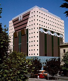
I have heard the name Michael Graves multiple times during my freshman year of college. In my History of Art class we examined the Portland Building and I noticed my aunt actually owns a tea kettle of his! He was born July 9th, 1934 in Indianapolis, Indiana. He actually graduated from the University of Cincinnati! I thought that was pretty intriguing because of how close it hits home. Graves is the director of the firms Michael Graves & Associates and also Michael Graves Design Group. Both of these firms work with a variety of clients, taking on projects that span from buildings to measuring cups. Graves is a very well known American architect and has been recognized a multitude of times for his work. Although in 2003 he became paralyzed from the waist down, he still is hard at work in his practices. I love the simplicity and playfulness of his work. Color seems big to him as well as appearance overall.

- "Michael Graves." Wikipedia, the Free Encyclopedia. 6 Apr. 2011. Web. 16 Apr. 2011. .
- MICHAEL GRAVES & ASSOCIATES. 2010. Web. 16 Apr. 2011. .

Sir James Dyson is an English industrial designer born on May 2nd, 1947. He is best known for his invention of the Dyson vacuum cleaner. He studied furniture and interior design at the Royal College of Art and later on switched to engineering. He developed his first products at the Royal College of Art. These included the Sea Truck, the Ballbarrow, the Trolleyball and the Wheelboat. After frustration with his Hoover vacuum, he developed his own design that would not loose suction as it picked up dirt and did not require a bag. The Dyson became patent in the U.S. in 1986. Rejected by all other companies, Dyson eventually outsold them number wise. This is a perfect example of developing a product to fix an issue, refining if you will. This is what we get at with the whole design concept, what we all should desire to achieve. Dyson does an excellent job at this and continues to do so as he develops more innovative products such as the Dyson Airblade. I thoroughly admire Dyson's simplicity and functional relationship that he develops in his products. Plus, the colors are so dang cute.

- "James Dyson." Wikipedia, the Free Encyclopedia. 11 Apr. 2011. Web. 16 Apr. 2011. .

Jan Tschichold was a very influential typographer before, during and after the Nazi regime. He was born in Germany in the year of 1902. His parents played an important role in his life, imposing the practice of lettering on him. As a starting occupation he taught illustration. However, his interests in calligraphy and script drew him away from his teaching as a young boy. He began to study every topic along these lines, delving into the practice learning all that he could. In 1924 he attended a Bauhaus exhibition that changed his mindset at the time. He was introduced to sans and bold lettering, lines and white space. Later in his life he ended up teaching both typography and calligraphy at the same time. His most influential work was The New Typography which was published in 1928. At the rise of the Nazi regime, Tschichold became imprisioned for his love of "un-German" design. A police officer helped him to escape to Switzerland. He found work here and strayed away from his modernist design. In 1946 he began work with Penguin Books helping them to create a set of rules for all of their publications to follow design wise. He continued to publish books even after his work with Penguin. He also developed the font Sabon. Tschichold died in 1974. I love the development of Tschichold's style of design. I relate to his love for typography and his constant searching and rethinking of how to use it. Specifically, I appreciate his work during the time where he was influenced by the Bauhaus. His bold lines, colors and askew set up is what really draws me to his design. Tschichold's life shows a powerful display of how design can implement power, especially in the case of the Nazi's offense to his pieces. Tschichold really shows that one can constantly be developing new ideas and opinions in their work and style and also use them to make a bold impact on society.

- "Jan Tschichold – Typographic Genius | Retinart." Retinart - Reflections on the Joyous Elegance of Graphic Design and Creative Thought. 2009. Web. 16 Apr. 2011. .

Monday, April 11, 2011

J02


I found this particular specimen in the closet of my best friend. It was in the form of a skirt. The brown, pink and cream combination along with the twist on a checker pattern drew me toward it.


I love the circular theme of this pattern. It is almost sort of spiral-like and also scale-like. I found this on a gift bag at World Market.


I like the sketchiness of this one. The color combination caught my attention. I also particularly enjoy the diamond like shape that it forms. I found this pattern on a scarf at World Market.


This pattern is so girly and floral. I was drawn to it because I love how dainty it appears. I found this on a scarf at World Market as well.


I love the simplicity of this one. The pointed section that keeps the pattern from being just stripes. I found this on a shower curtain. The earth tones also drew to this piece.


I like the organized chaos of this pattern. The circles of lighter colors blend well with the random array of shapes that seamlessly fit together to form the design. This one was also on a shower curtain. It sort of gives off a tribal kind of feel which drew me toward it.


I like how big this pattern is. The shapes themselves are very detailed and then are used repeatedly to create a larger picture. I love the detail a lot and I think that is what drew me toward this pattern. It is a nice balance of detail and overall simplicity. This was on a shower curtain as well.


I love how geometric this one is. It is very organized yet interesting. The pattern overall is simple but guides the eye all over the place as it forms patterns and shapes. This was on a lamp shade.


I find myself being drawn to patterns similar to these. I love how the varying colors create a step-like pattern that gives off a diamond shape. The different parts of this pattern are intriguing as well because they share similar qualities (diamond like shape with step-like lines around it) but look like entirely different objects. This was a chair covering that I found.


This is a woven wooden basket that I found. I love how even in 2D form it looks slightly 3D with the parts that a woven on the outside. For me this creates a nice pattern that again is a twist on the traditional checkered look. The varying exposure to light in certain areas really makes the pattern interesting as well. Also, the spaces in between the outer woven pieces is simple with it's two vertical lines. I enjoy this one a lot.

Saturday, April 9, 2011

CR01

So far I have thoroughly enjoyed this class. I have been learning so much; my mind has been stretched to think abstractly and it is only approaching the third week. The historical overview was very intriguing and it is crazy that Gabe said they would be the most boring notes in class! Design is so different than what everyone always assumes it is. From the historical overview I realized that design is in everything and it has evolved from such a variety of ideas. Specifically from that lecture I think of the evolution of the chair. Never have I ever taken that aspect of design into regard. Who knew that chairs are so uniquely and intentionally designed? The class Tuesday where we visited the FIN and ARC libraries was were my mind really started to get blown. The first book I picked up in the FIN library was a collection of everything that I long to do with design. It was so fun to realize that and get a taste of the knowledge that I have never even thought to explore. Looking at books and magazines and even walking around campus with Gabe talking about architecture opened up a whole new world to me...cheesy as it sounds. I have never given architecture even a thought but that day I was so observant and eager to hear more about how and why these buildings on campus were built the way they are. This day in class put a desire to know and delve into so much more about design in the way that I think and look at things in my life. These thoughts translated into our next class were we talked more about the specific breadths of design. I was so interested in all of them, realizing my naivety in concentrating only on Visual Communications. I loved learning a bit of the "staples" of design. Topics like symbol v. icon and sans v. sans serif. I also undoubtedly enjoyed the bit on Paul Rand. I desire to know more designers and their work. All of this taken into consideration makes me excited to see how the things I am being exposed to and learning will correlate with my relationship with design.

Saturday, April 2, 2011

A01 | J01

Hello hello! My name is Aggie Gerhardt. I am a freshman at OSU. I lead YoungLife in the Greater Columbus Area. Even though it is grandma-y, sometimes I like to knit a little something up. My favorite candies are those Sour Patch Kids watermelon things. I thoroughly enjoy music in the background of everything. And lastly, choreographed dance is my downfall.

I am looking to major in Visual Communication Design but I am open to minoring if I am not accepted into the program . I was a designer on my high school's newsmagazine and I loved every minute of it...like, I was nerd-ily obsessed. This sparked my interest in this particular major and I have been trying to figure out how to learn more about design ever since. I went to a preparatory meeting put on by students already in the major to help out with the exam. They advised that I take Design 201 right away to get my drawing skills in shape and then that I take 200 before the end of my freshman year. So, here I am! And I am looking forward to a class that is entirely about something I am interested in.